Terroir and Origin are the Heart of Cognac's New Visual Identity

COGNAC, France, Nov. 14, 2017 /PRNewswire/ -- The words "COGNAC FRANCE," in a timelessly elegant font, are written over a rich, earth-tone image in the exact shape of the Cognac region; these are the essential elements of the Cognac appellation's new visual identity. This reimagined logo reminds us that this inimitable and world-famous beverage is a product of one, and only one, place. Unveiled worldwide on November 14, the new visual identity will be used in all markets and on all communication materials of the Bureau National Interprofessionnel du Cognac (BNIC), the association that represents the interests of all the people who grow, distill and export Cognac, and protects the integrity of their product worldwide.
Following the creation of a brand DNA in collaboration with French communications agency Bayadères, the Cognac growers and shippers selected Paris and New York City design studio Be-Poles to create their custom visuals. Vincent Chappe, President of the BNIC's communications committee, says: "We have chosen an identity that is inspiring, like Cognac itself. The image of the region is both brilliant and down-to-earth at the same time. This new visual identity lets us tell consumers the wonderful story of this place and its people, who together, create the spirit in which we have such pride: cognac."
An Inspiring Palette: Earth, Copper, Light
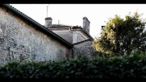
Spanning the Charente, Charente-Maritime and parts of the Dordogne and Deux-Sèvres départements in southwestern France, the Cognac production area was officially delimited in 1909. Bordered by the ocean and traversed by the Charente River, Cognac's open plains and rolling hills contains six Crus, characterized by clay and limestone soil. Clémentine Larroumet, director of Be-Poles Design Studio, drew inspiration from Cognac's singular landscape and light. "I was also inspired by the traditions and craftsmanship of the people who create Cognac, by their vines and the tools of their trade, especially the copper stills."
The studio took into account the high-end positioning that Cognac's producers have established and translated their desire to place their terroir–a defining aspect of Cognac– and know-how at the heart of their identity. The choice of Garamond font for the words Cognac and France is a case in point: it was created by the famous typographer Claude Garamont in the sixteenth century, the same period in which distillation of Charente wine was begun for easy transportation to northern Europe.
A Worldwide Reach
Cognac is exported to 160 countries, representing 98% of the world's markets. The new identity targets all market sectors but with an emphasis on influencers in the trade and consumer channels. According to Claire Caillaud, BNIC Communications Director, "It will reinforce cognac's image as product of guaranteed provenance and authenticity, and highlight its distinguished place in France's age-old traditions of winemaking and gastronomy." Authenticity, terroir and a sense of place are what today's consumers seeks, and the new identity aims to address those key messages for the long-term.
Media Contact:
For more information, please contact:
Teuwen Communications
Stephanie Teuwen | [email protected]
Cassidy Havens, DipWSET | [email protected]
Gabriela Marchand | [email protected]
SOURCE Bureau National Interprofessionnel du Cognac

Share this article